
Project Type:
Buffalo Bisons Rebrand
Deliverables:
1 Primary, Secondary, and Word Type Logo Design/Brand Guide
1 Hat produced; 2 Digitally Mocked Up (Home/Away)
2 Uniform Digital Mockups (Home/Away)
1 T-Shirt Toss Design Produced
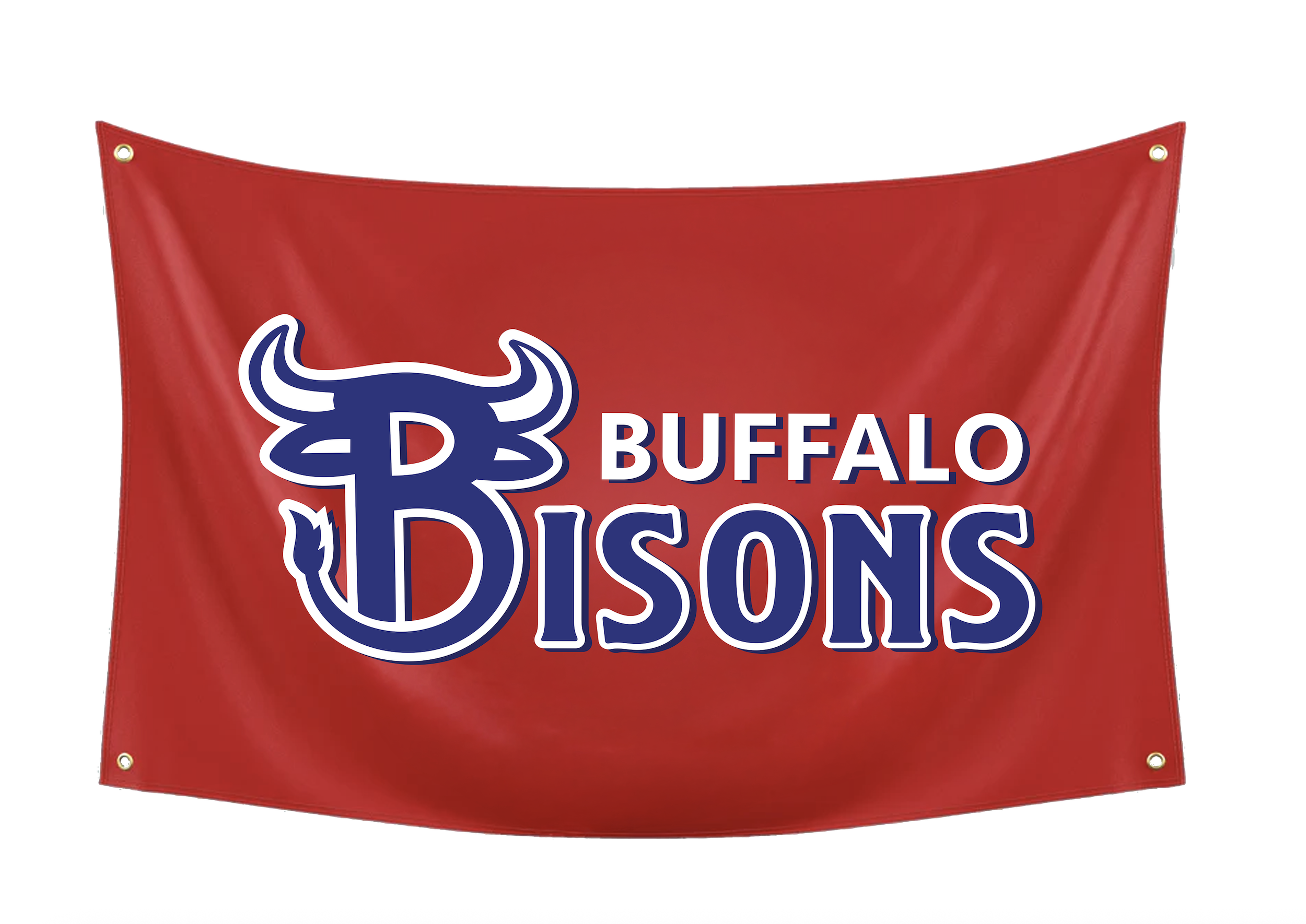
1 Custom Dorm Banner Produced
1 Prototyped Website Homepage (Roster, Merch, and Schedule Page)
3 Environmental Graphic Digital Mockups (Flagpole Banner, Seating Map Display, and 1 Extra Stadium Signage)
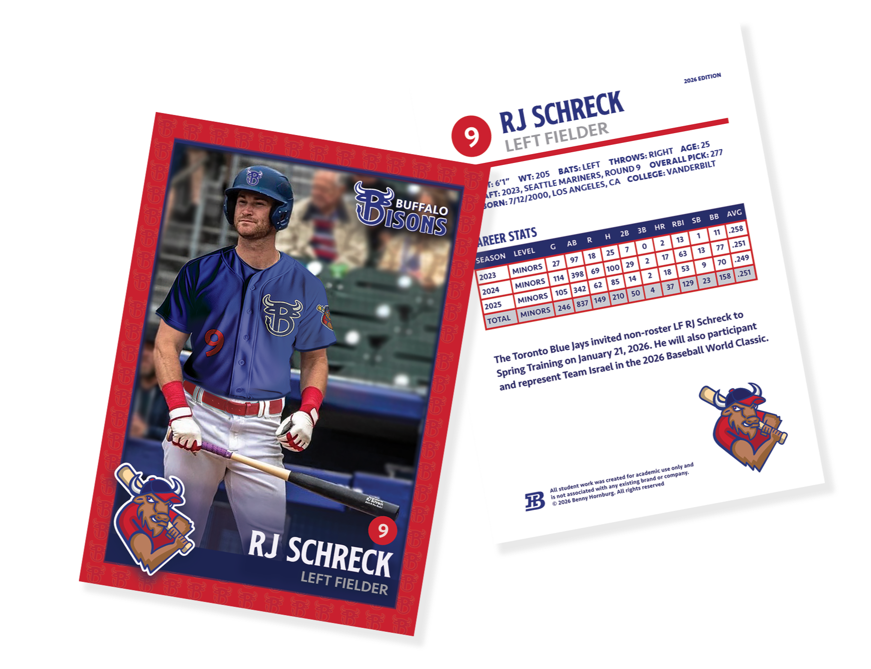
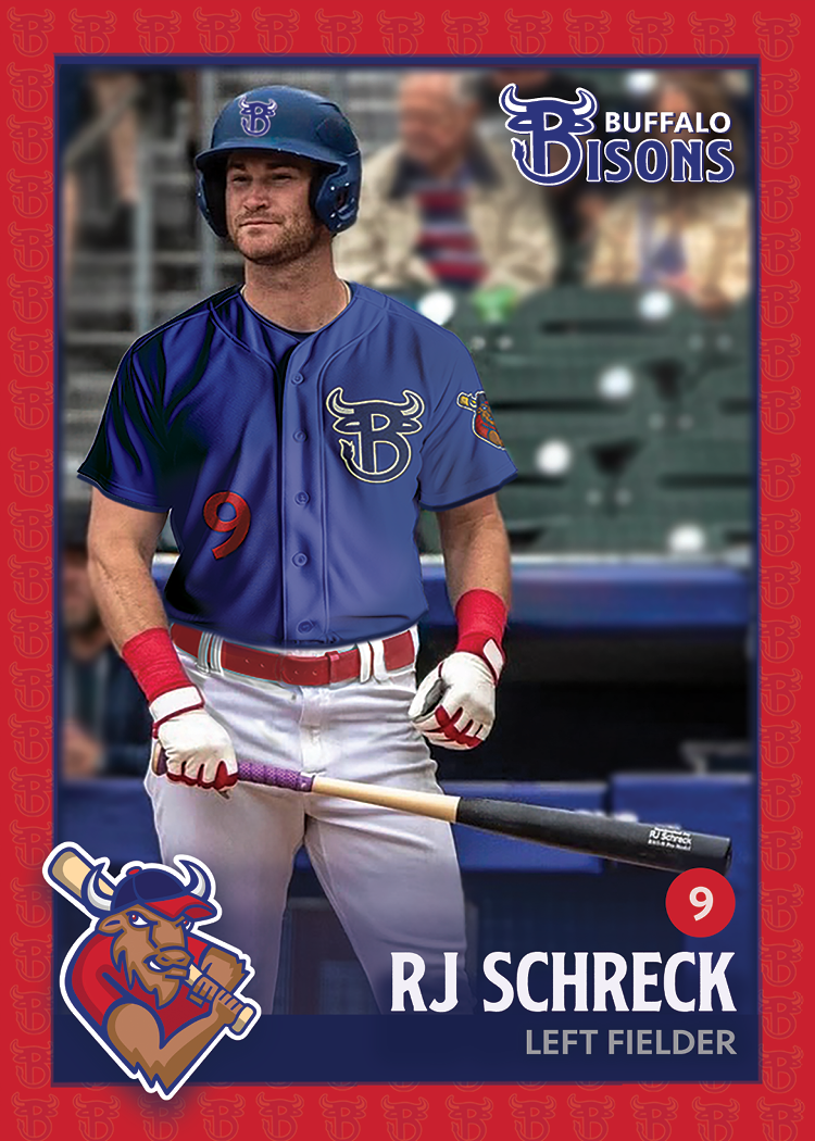
1 Baseball Trading Card Design; 50 Produced
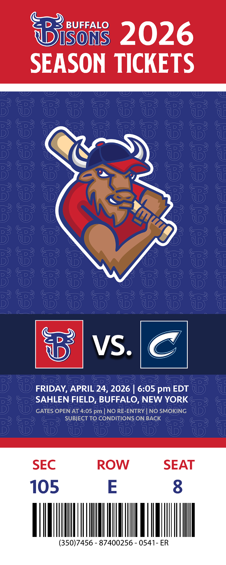
1 Game Day Ticket Produced
Social Media (6 Instagram Tiles/ Promos)
1 Program (3 Ads/ Promos, Schedule, and Roster, Stadium Seating Map) Produced
Brand Profile
The Buffalo Bisons are a Minor League baseball brand based in Buffalo, New York, and a Triple-A affiliate of the Toronto Blue Jays. The Bisons are one of the oldest and most historic franchises in professional baseball. The Bisons play their home games at Sahlen Field, which is known for its fan-friendly atmosphere and views of the city of Buffalo. The Bisons are known for developing players for the MLB and are an affordable, family-oriented entertainment for the local community.
As a franchise, the Bisons’ mission is to have community engagement, tradition, and accessibility. Their branding reflects a blend of classic baseball heritage and modern design, often incorporating bold typography, clean layouts, and the iconic red, white, and blue color palette. The team is known for hosting themed game nights, promotional giveaways, and community outreach programs that strengthen their connection with fans of all ages.
Proposal
Many sports teams struggle with knowing when it is time for their brands to be updated and to feel more on trend, usually involving a fear of becoming unrecognizable to their current fanbase, but also wanting to grow and attract new fans with more of a modern feel. The Buffalo Bisons are a Triple-A Minor League Baseball team and the affiliate of the Major League Baseball Team, the Toronto Blue Jays. The team has honored the Bison for decades as their main mascot and primary brand element due to being a sentimental creature to Buffalo’s culture. However, they have not updated their current logo since 2013, making it outdated and ready for a brand refresh. As a potential solution, I strive to create a rebrand for the Buffalo Bisons that balances the team’s sentimental tradition, rooted history, and identity, while incorporating more of a modern sports design. I am going to keep the team’s current color scheme due to its rich history with the organization; however, I am updating the team’s primary and secondary logo and typography to have the overall visual language fit more of our current times.
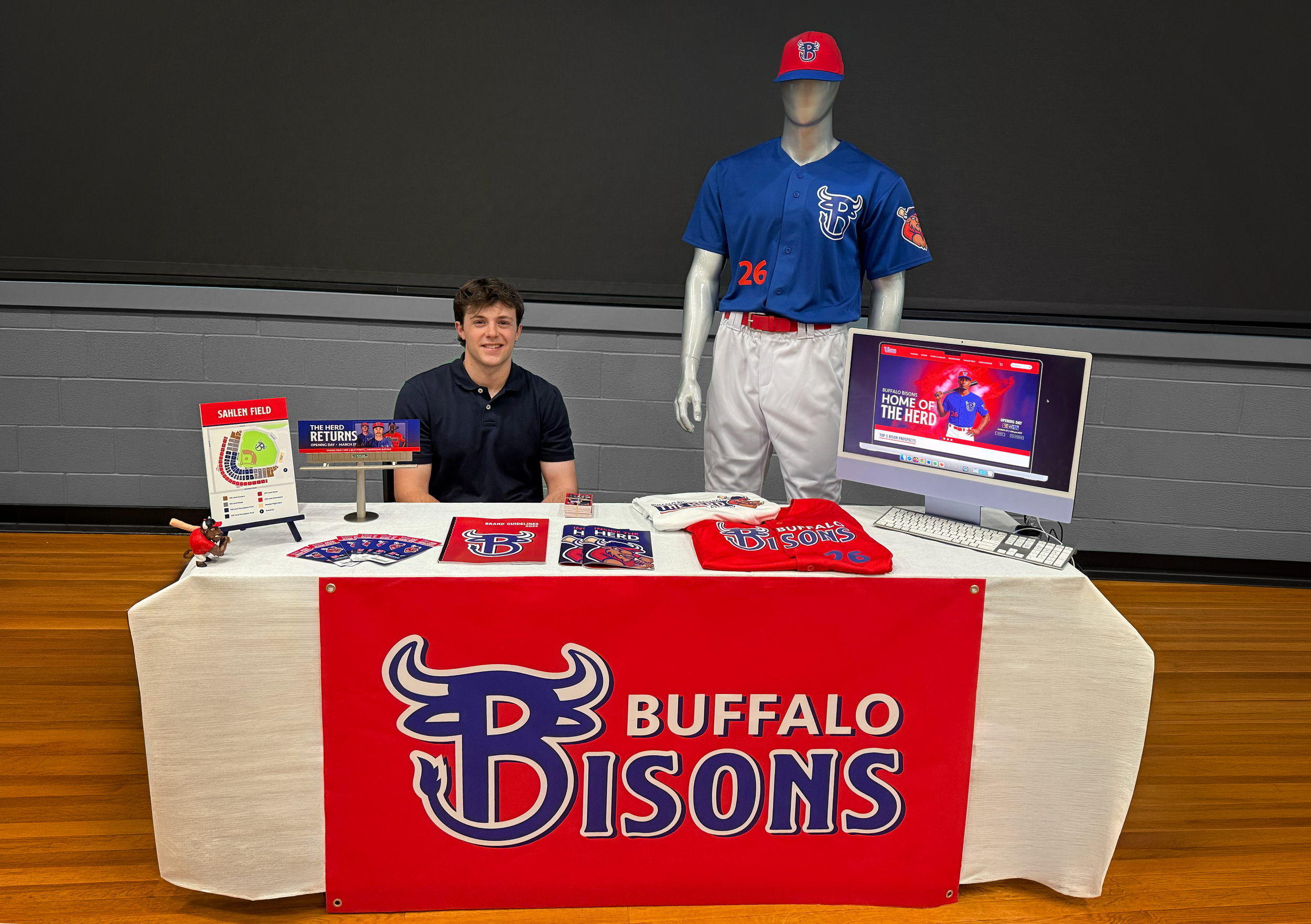
The rebrand will be applied across a wide range of design components, with each component being thoughtfully designed to enhance fan engagement and maintain consistency across signage, merchandise, promotional materials, and digital experiences. There will be precise attention to detail and specific methods, like digital mockups, before any production is made. The digital mockups will help allow for careful consideration of scalability and usability to ensure the brand performs effectively in professional sports branding environments.
Target Audience
The target audience for the Buffalo Bisons rebrand is sports fans of all ages within the Buffalo area, as well as sports fans nationwide, making flexibility essential in the design system. This project aims to appeal to both loyal fans who value the team’s legacy and rooted history, as well as bring in new fans drawn to a bold, up-to-date aesthetic. By balancing tradition with modern design principles, the rebrand will strengthen the Buffalo Bisons’ identity, elevate fan connection, and make the organization more recognizable and competitive presence within Minor League Baseball and the sports industry.
Project Objectives
To independently research, design, and produce a logo system (primary and secondary logos), a hat, 2 jersey mockups, a program, a website homepage, a game day ticket, a baseball trading card, 6 Instagram tiles/promos, and 3 environmental graphics (flagpole banner, seating map display, and a billboard for the highway) for the Buffalo Bisons rebrand.
To develop a cohesive and versatile brand system that reflects the energy, competitiveness, and tradition of professional baseball.
To apply graphic design principles like typography, color theory, hierarchy, layout, and composition to create visually effective and functional designs across both print and digital formats.
To create and produce a cohesive design system throughout physical, digital, and environmental deliverables.
To evaluate my rebrand design decisions from peer and professor critique, as well as self-reflection, to improve the work throughout the semester.
To plan and manage my calendar specifically to have the proper sequence of design elements, like physical production to digital designs.
To analyze historical parts of the Buffalo Bisons franchise to make sure to respect for the integrity of the already established brand.
To strengthen my presentation and communication skills by clearly describing all my deliverables and the rationale for the Buffalo Bisons rebrand.
Process Work
Process Narrative
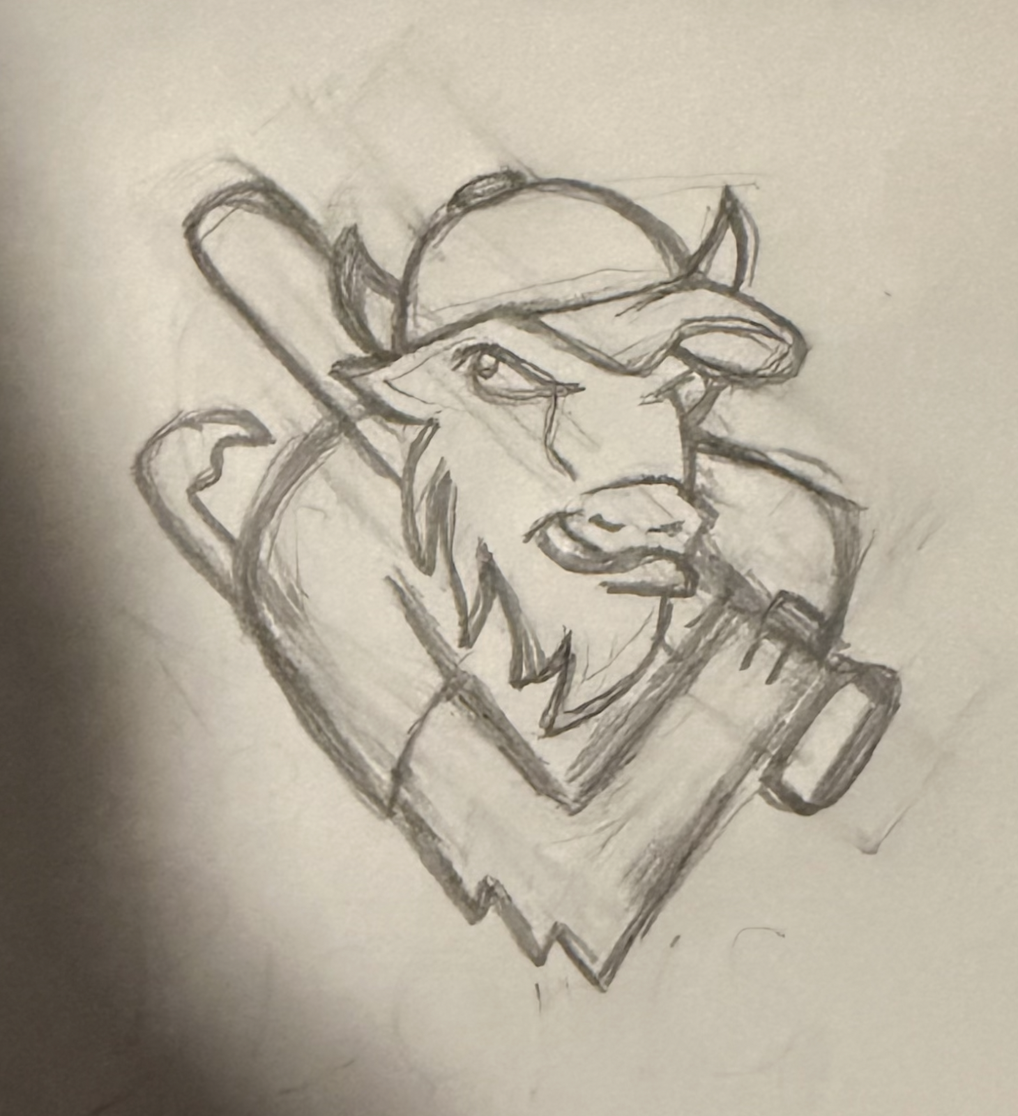
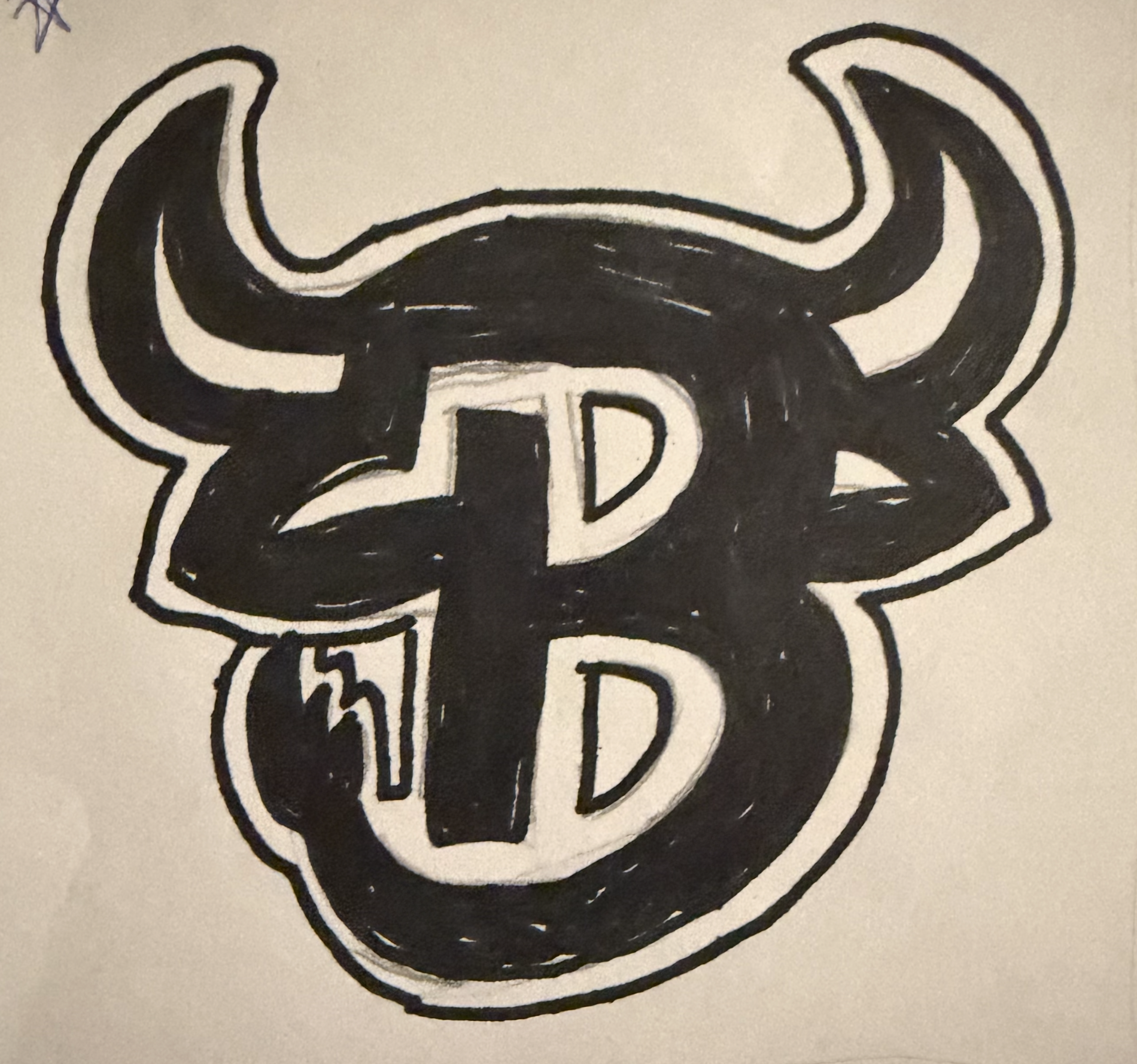
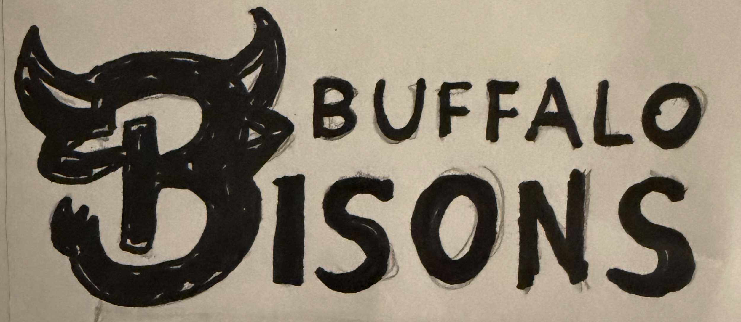
The process began with researching logo trends in professional sports and conducting an analysis of the current Bisons logo and identity. Rather than changing the whole vibe and historical aspect of the brand, I came up with ways to make the logo feel more modern and on trend. To generate ideas, I created a word list to explore a new spin on the existing logo and figure out key elements such as the bison mascot, the letter “B,” and baseball iconography. I then moved into creating multiple thumbnails, starting out with rough sketches and then moving into digital comps. The sketches were mostly for the logos rather than the other components of my project. I started on paper to generate ideas quickly and decide what the subject of the marks should be, given that there were elements that should still be a part of the marks, such as the mascot and name of the Bison itself. Eventually, through different iterations and critiques, I decided on the final concepts for the three new marks that would shape the Buffalo Bisons rebrand.
Once I had decided on concepts, I shifted to digital and made refinements using Adobe Illustrator. During this stage, I experimented with adding color, typography, and other details that would make for a strong logo system. Once those steps were completed, additional brand elements were developed using Adobe Photoshop and Adobe InDesign. The brand guidelines, 2026 game day program, uniforms, player trading card, game day ticket, merchandise, dorm banner, social media ads, environmental designs, and a whole new website prototype were designed to align with the overall visual system, ensuring consistency across both digital and physical applications.
Once I had a system down, I was able to stay consistent throughout to make the Buffalo Bisons rebrand fit the trend of professional sports today while keeping the historic aspect of the franchise.
Research Synopsis
Research was a key factor in shaping both the visual identity and components of the Buffalo Bisons rebrand. The process started by looking at team branding in minor league baseball and professional sports. Articles such as Uncovering the Evolution and Impact of Iconic Sports Logos by DCAdmin and Timeless Designs: The Evolution of Sports Logos Over the Decades by My Event Artist helped me better understand the trends of sports logos and what makes them so successful. This foundational research gave me enough background to move into the initial sketching phase, where a range of thumbnail concepts were developed. Additional inspiration was drawn from established sports logo designers, including Joe Bosack, whose work influenced the development of a modern, cohesive logo system.
After I created the logo system, I visited the Buffalo Bisons website to look at the team’s current identity and gather necessary content for my deliverables, such as social media graphics, a 2026 gameday program, a player trading card, and a website prototype. After I got all the information I needed from the Bisons official website, I went on Pinterest to spark some stylistic inspiration for the new Bisons brand vibe. I also used Instagram to follow design trends, as I follow a multitude of professional sports teams that are well-established, such as the Pittsburgh Steelers, the Toronto Blue Jays, the New York Yankees, the Pittsburgh Pirates, the Los Angeles Rams, the Oklahoma City Comets, and the Fayetteville Woodpeckers. Additionally, prior experience with Little League International contributed to an understanding of branding consistency across multiple formats and physical outputs.
Finally, as I was creating my website, I looked at successful athletic and sports companies like the MLB, Nike, and Under Armour, to see how the user experience is for the viewer and what trends are going around currently for athletic brands. Using these existing brands, I compiled the necessary info and created layouts for the products, keeping in mind the graphic elements. Similar research and design processes were applied across all brand deliverables, including merchandise, uniforms, environmental graphics, and printed materials, to create a cohesive, iconic, and realistic brand system.
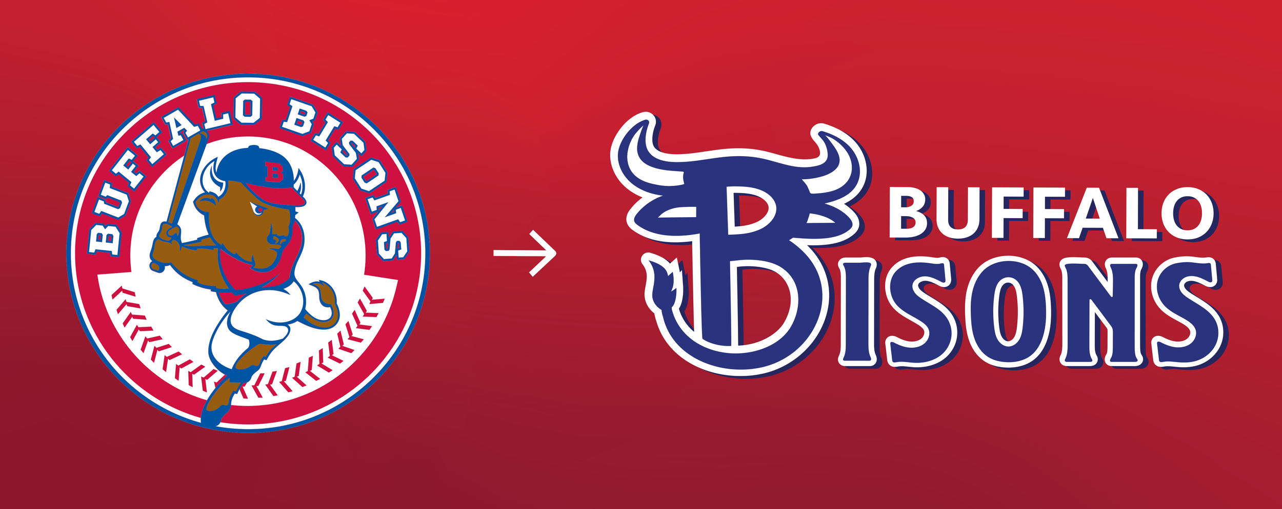
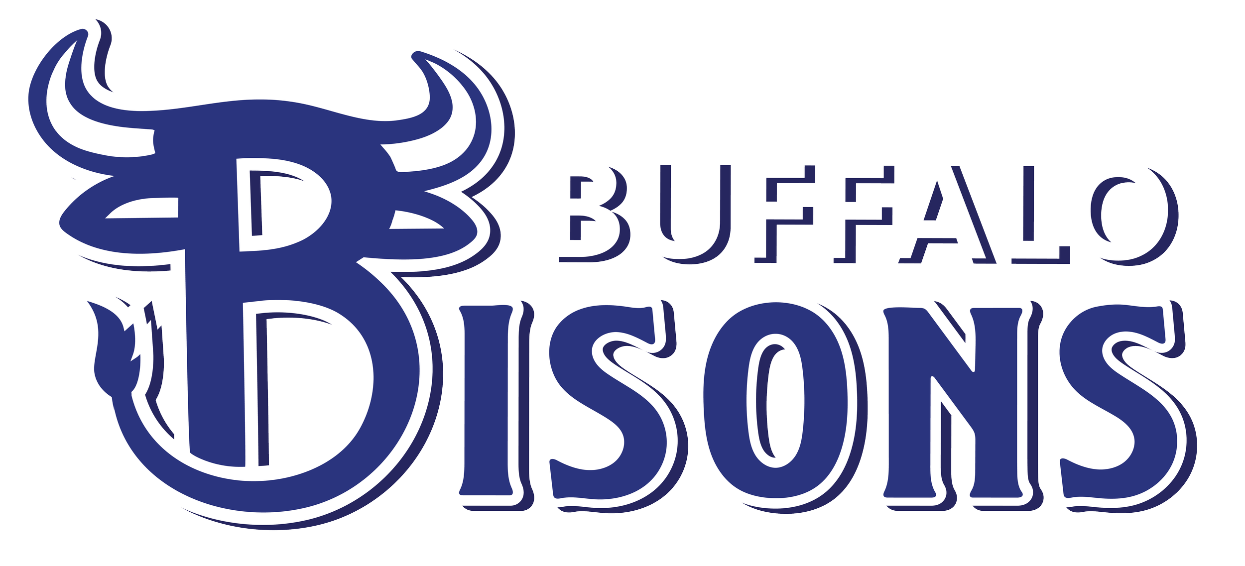
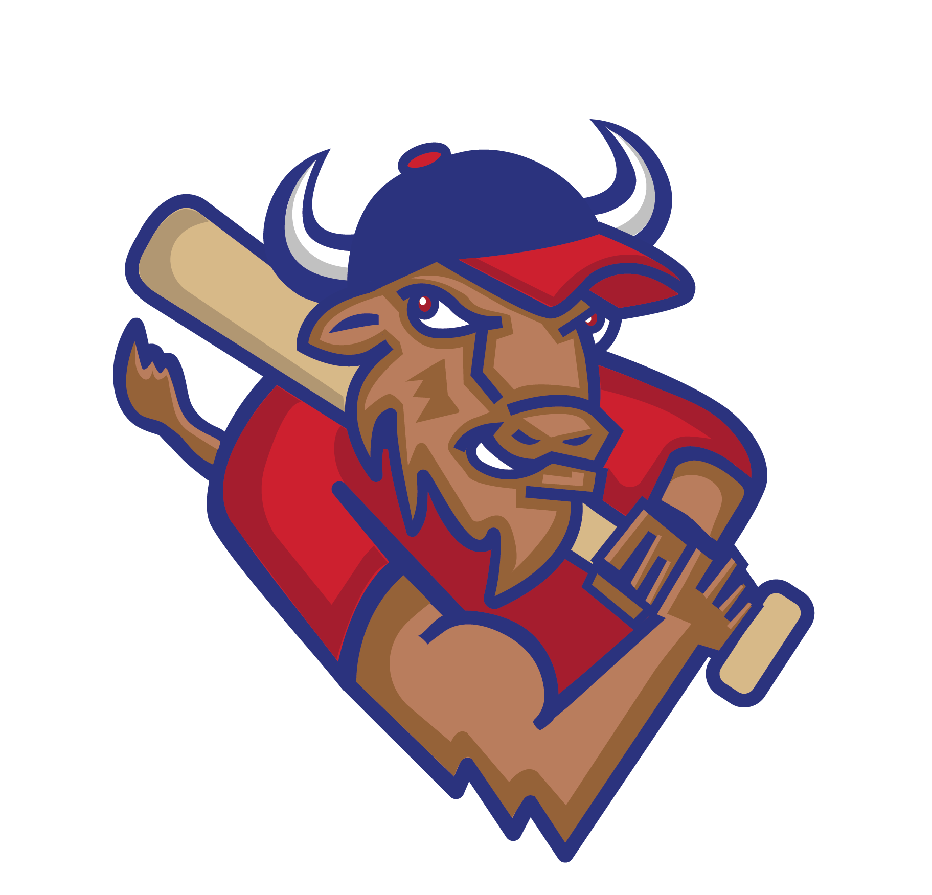
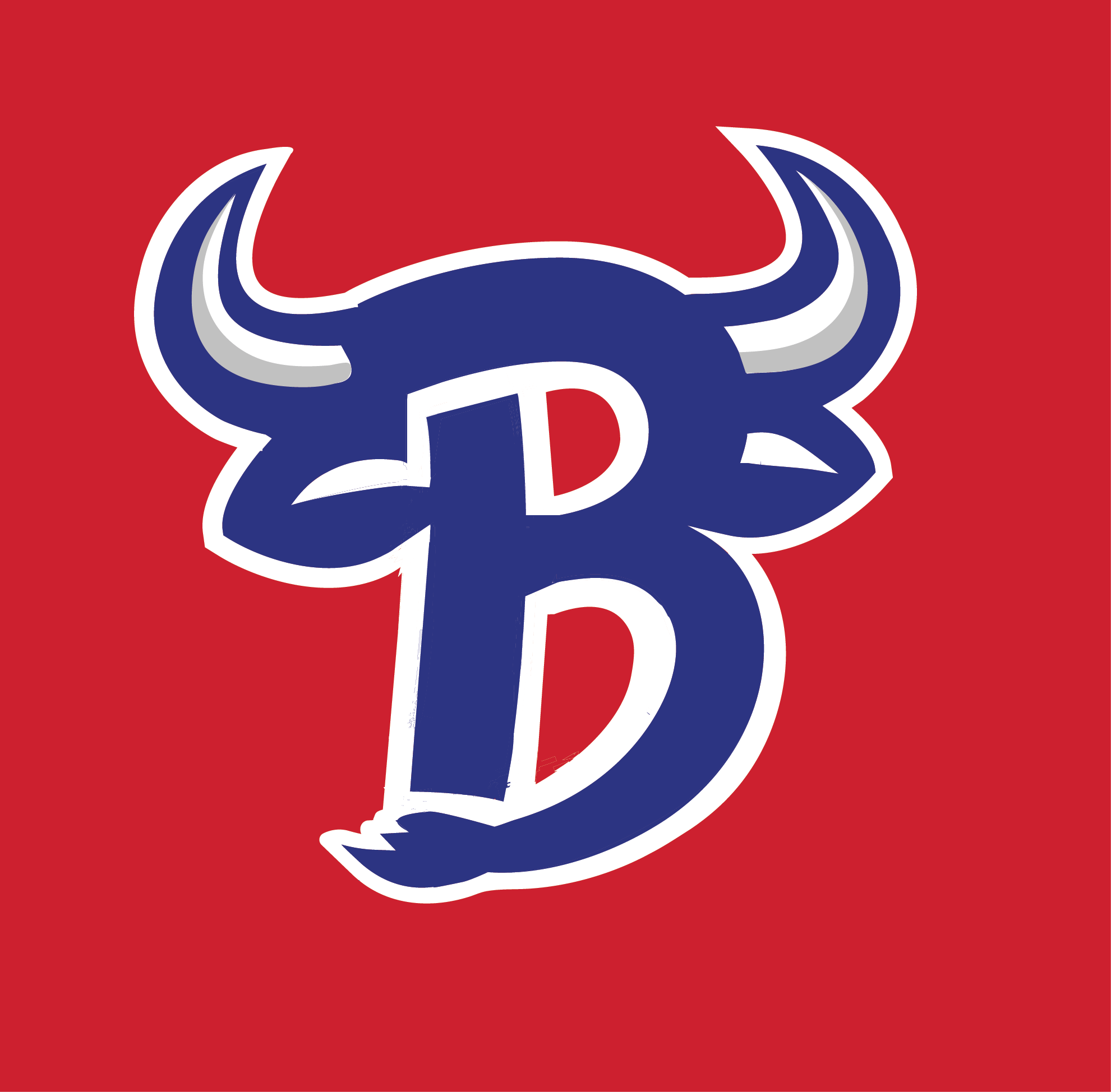
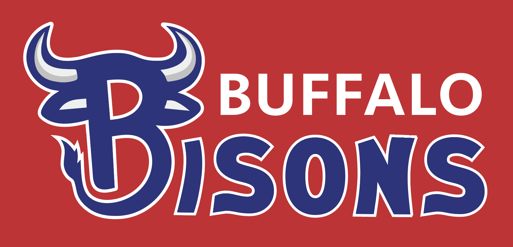
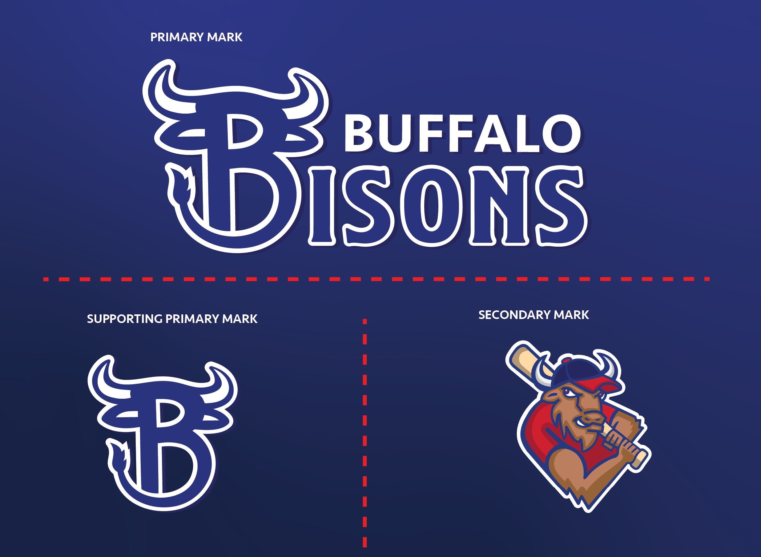
Final Logo System
The logo system is built for use across a variety of applications. The Primary and Supporting marks utilize a custom lettermark that anthropomorphizes the letter “B” through the integration of a bison’s horns and tail. Complementing these is the Secondary Mark, which stylizes the team’s mascot within a geometric diamond shape to reinforce the brand's athletic core and baseball identity.
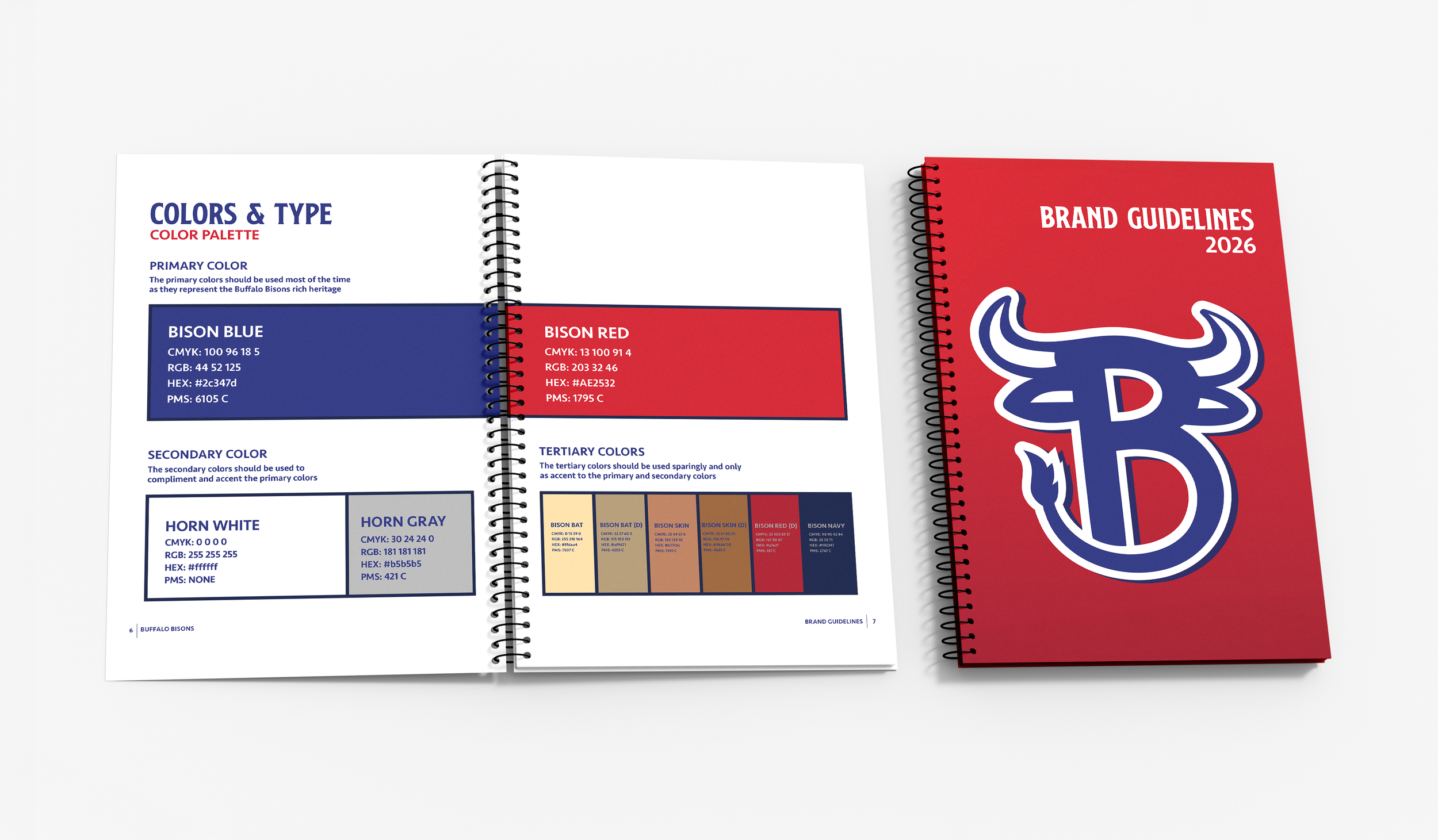
Brand Guidelines Book
The Brand Guidelines act as a design blueprint for the Buffalo Bisons' visual identity. This book ensures that there is total brand consistency across all platforms and shows how to use logos, colors, and typography. This book is the foundation to maintain a unified and professional presence, whether in print, digital, or environmental applications.
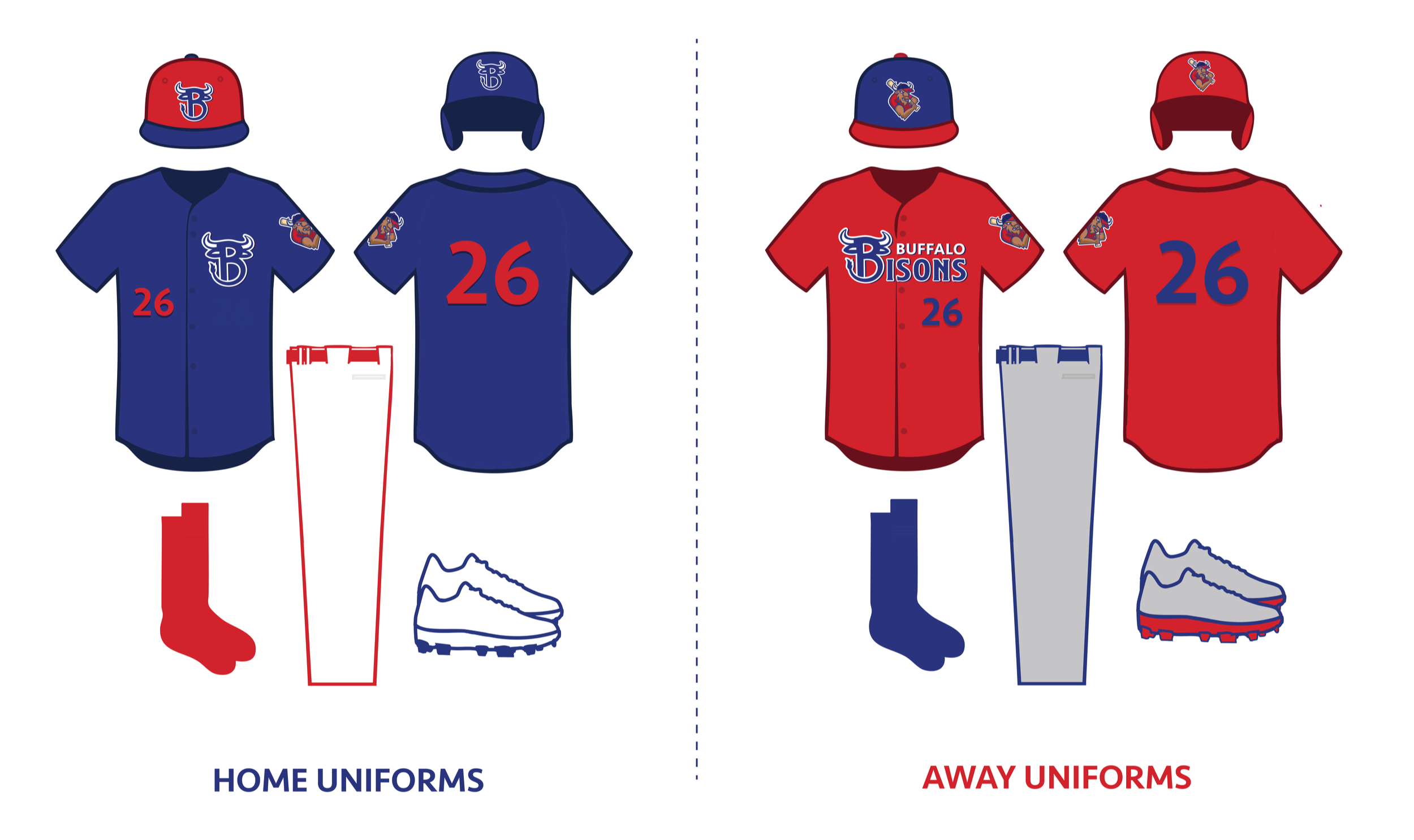
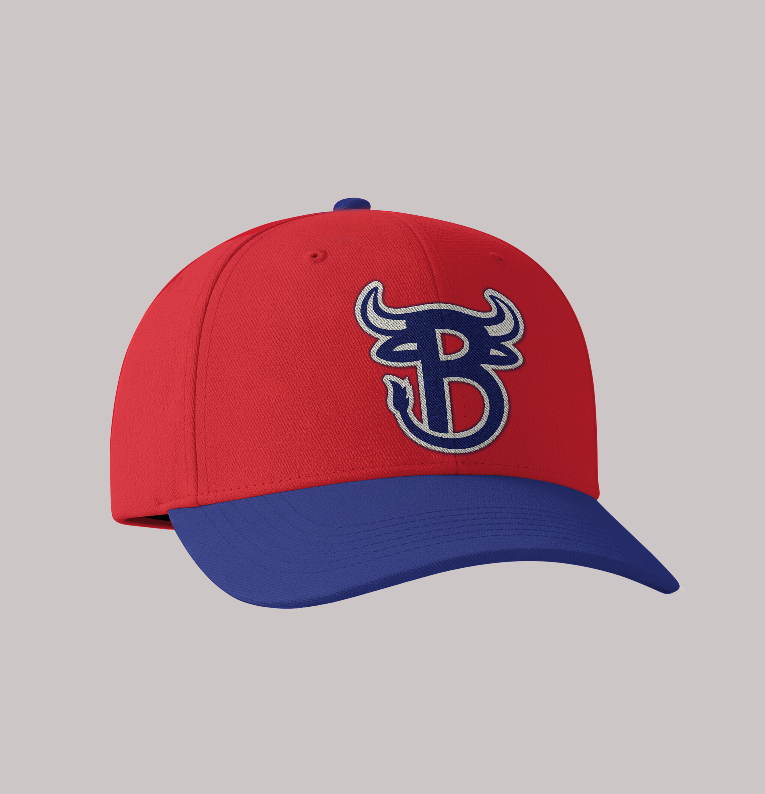
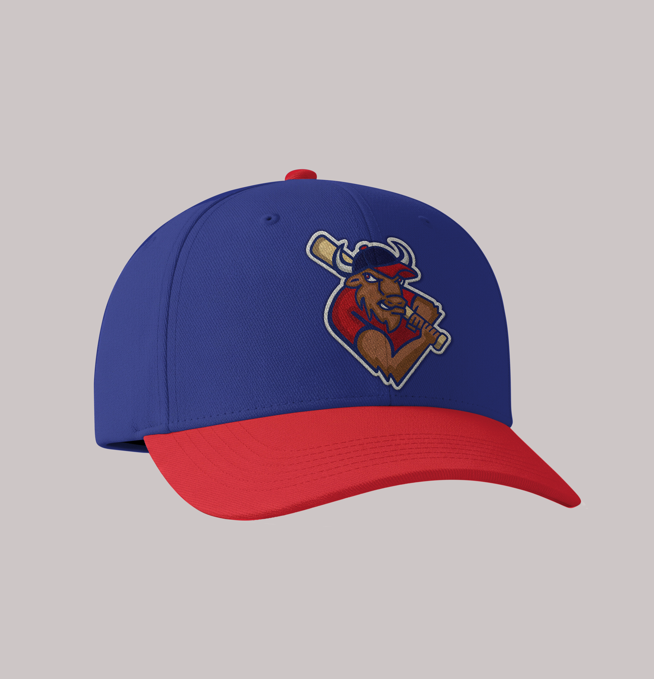
Uniform System
The uniform system displays the Home and Away uniform for the entire season. The Home uniform is a navy jersey and red cap to modernize the identity, featuring the custom lettermark as a central focal point. The Away uniforms are a red jersey paired with the primary wordmark and a stylized bison mascot cap to reinforce the team's identity on the road.
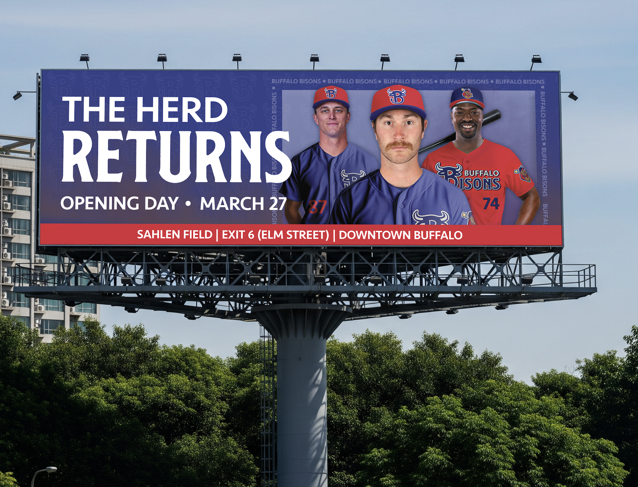
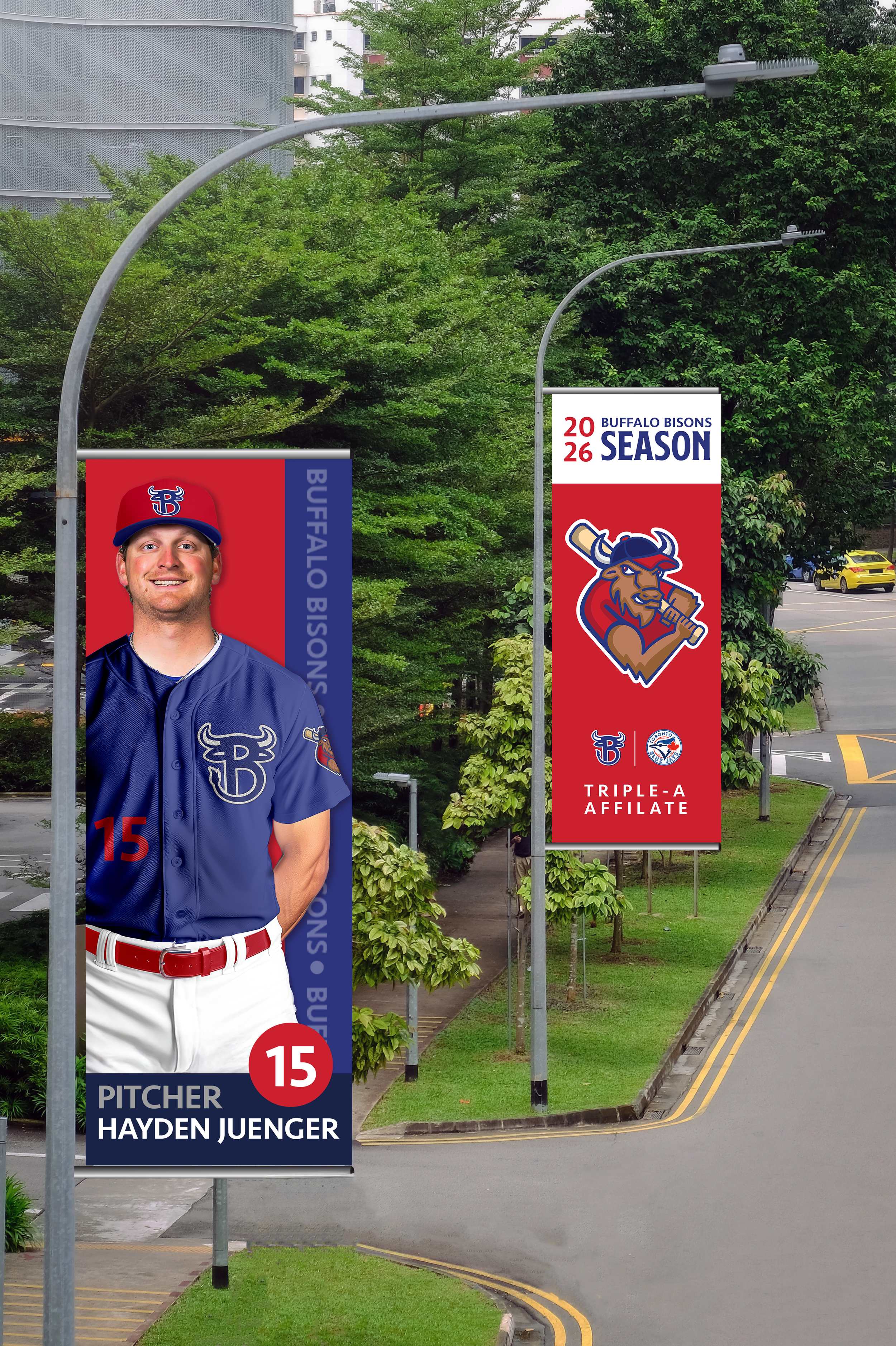
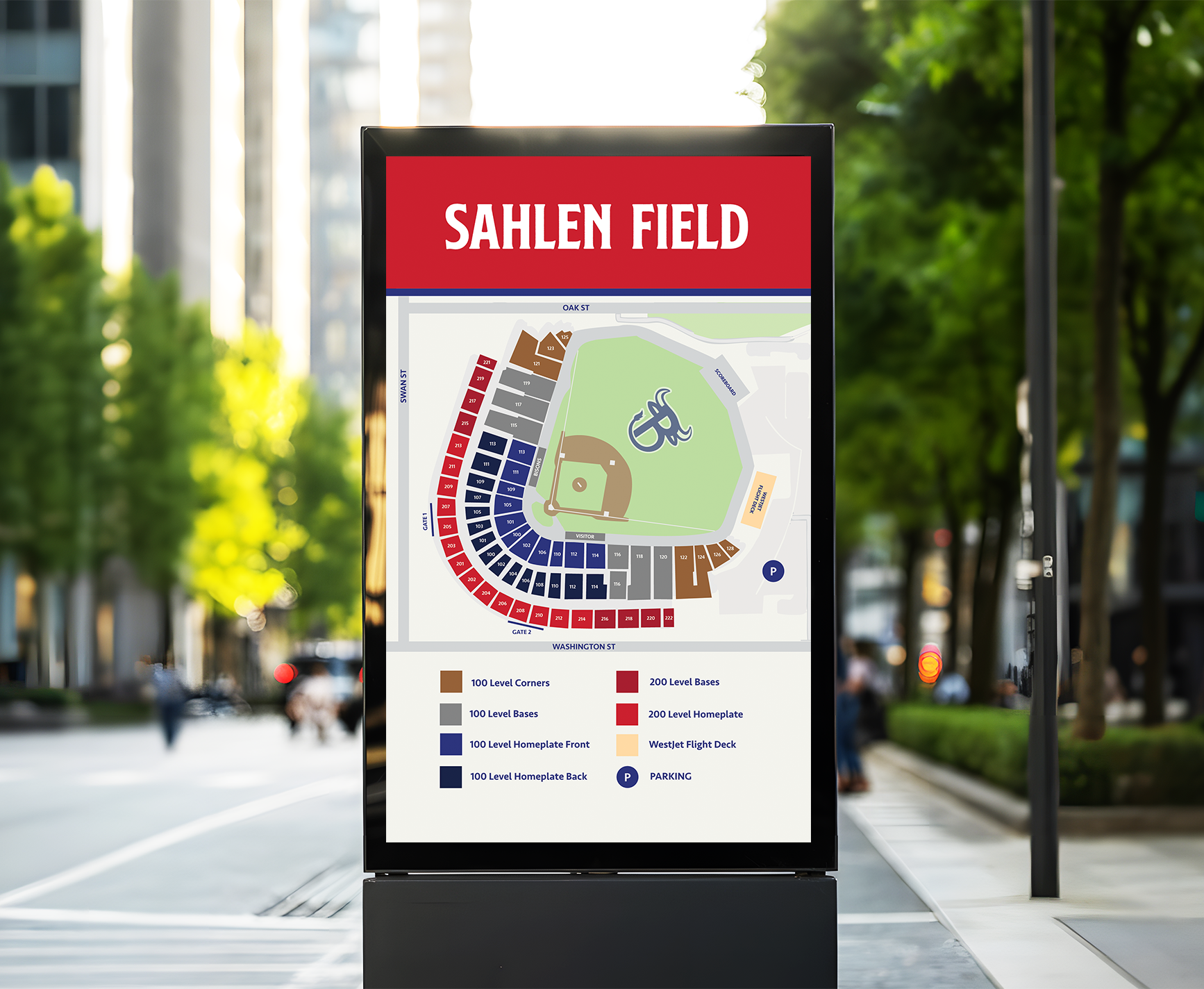
Environmental Graphics
These environmental graphics extend the brand’s visual identity into the physical landscape. The larger-scale billboard and street pole banners use photography of players and the brand typography and colors to drive community engagement for the entire season. Complementing these is the stadium seating map, which would be seen outside the stadium as well as inside, to help fans navigate to their seats. The design prioritizes clarity through a diagram of the stadium and color-coded navigation, reinforcing the brand's organized athletic presence throughout the ballpark.
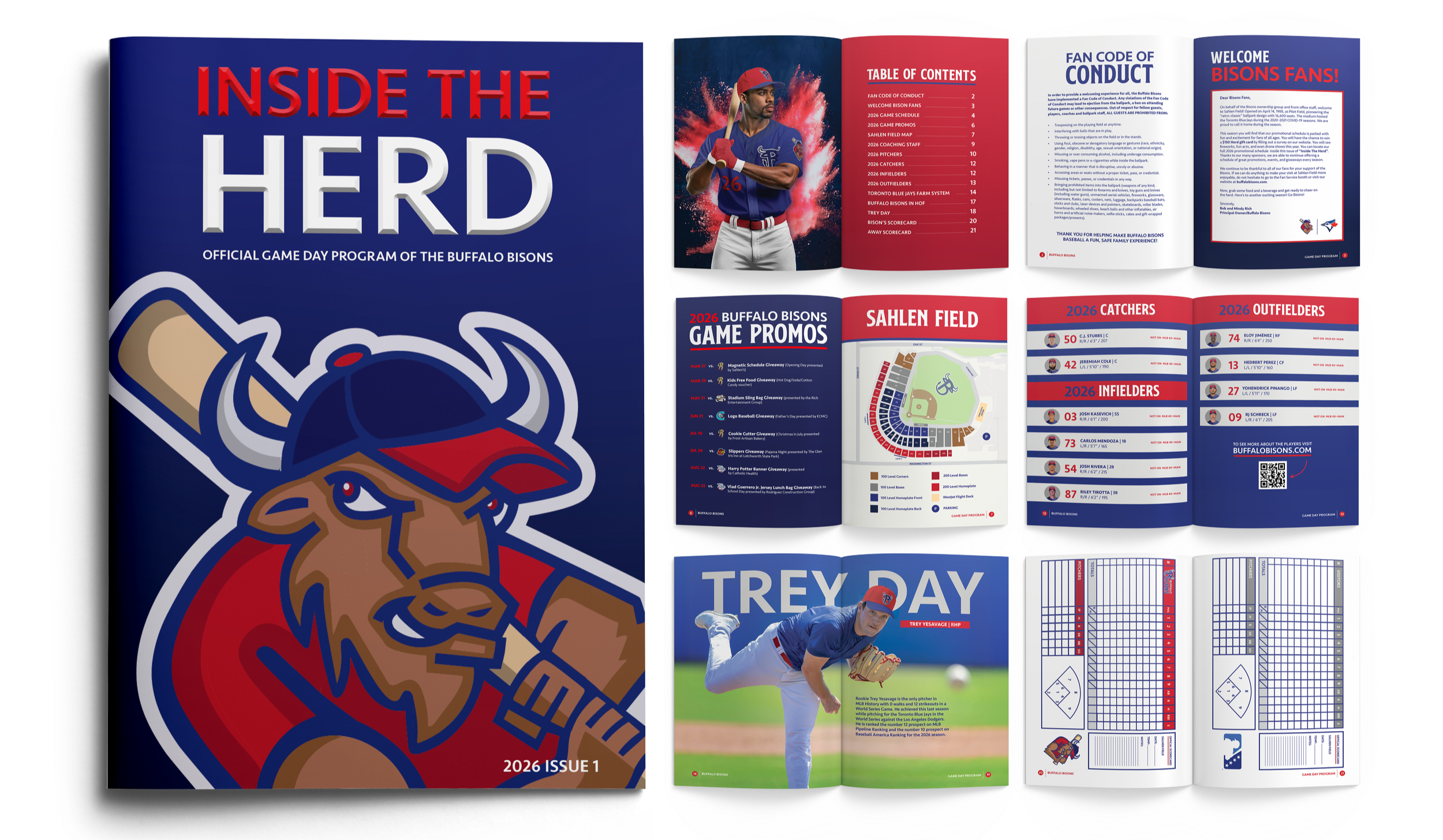
Game Day Program
This game day program would be handed out every game day and is a multi-page layout called Inside the Herd. The cover displays the secondary mascot mark to create an immediate impact of the team’s competitive nature and represent the new Bison identity. The interior spreads follow the brand guidelines for type hierarchy and use structured grids and color-coded player rosters to ensure high legibility and an organized reading experience. The design prioritizes a balance between dynamic sports photography, team ads, and clean typographic hierarchy, reinforcing the brand's professional and accessible identity.
Website Prototype
The website prototype allows for an interactive fan experience. The Homepage utilizes a hero-focused layout and primary brand colors and typography to reinforce brand consistency. The website includes the team's full game schedule, roster, tickets, promotions, a map of Sahlen Field, and a merchandise page. The design is to ensure that this brand's modernized aesthetic remains consistent across desktop and mobile platforms. By balancing bold action photography with clean interface elements, the prototype reinforces a professional, tech-forward presence that bridges the gap between the stadium and social media experience.
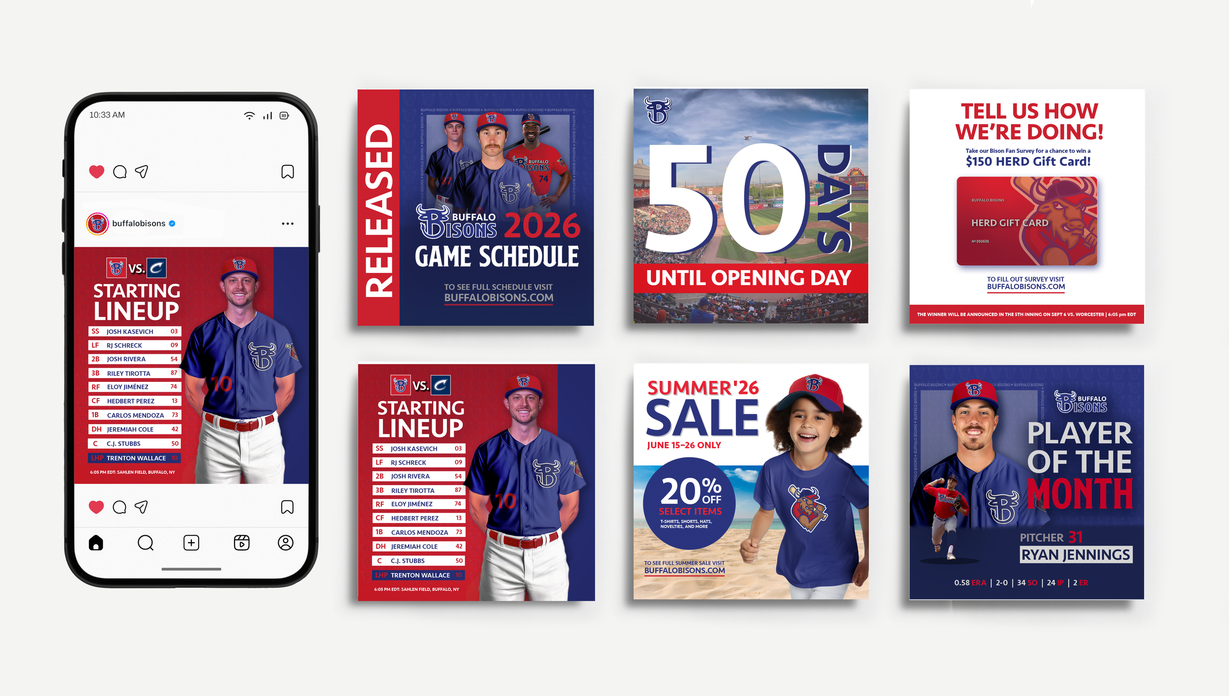
Instagram Tiles
This is a series of 6 different possible Instagram tiles that would be seen on the team’s main social media account to promote the team as well as provide more information for the fans. These tiles use color blocking, strategic typographic layering, and dynamic photography with structured brand elements to ensure a cohesive and professional aesthetic across the team’s digital platforms.
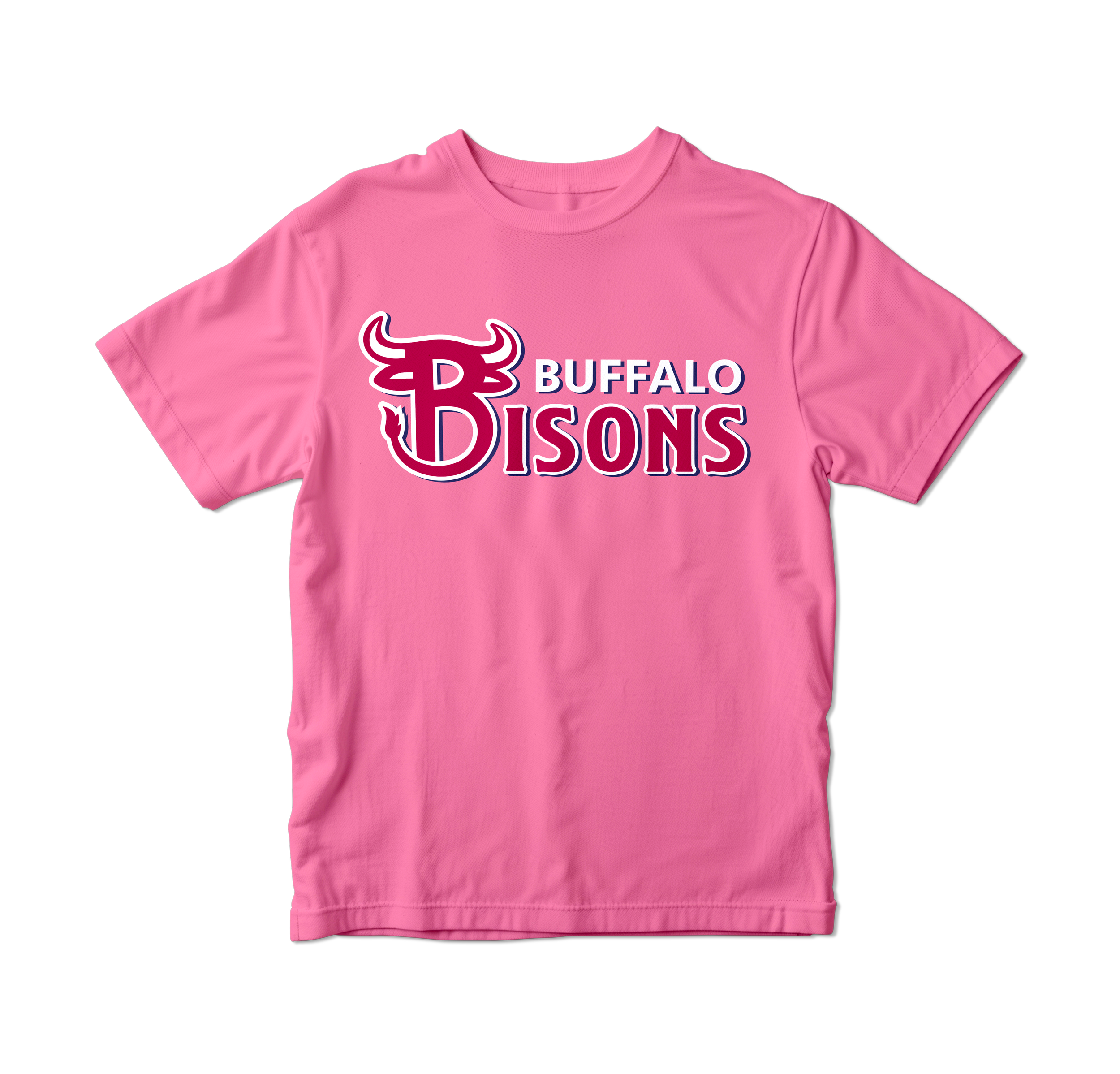
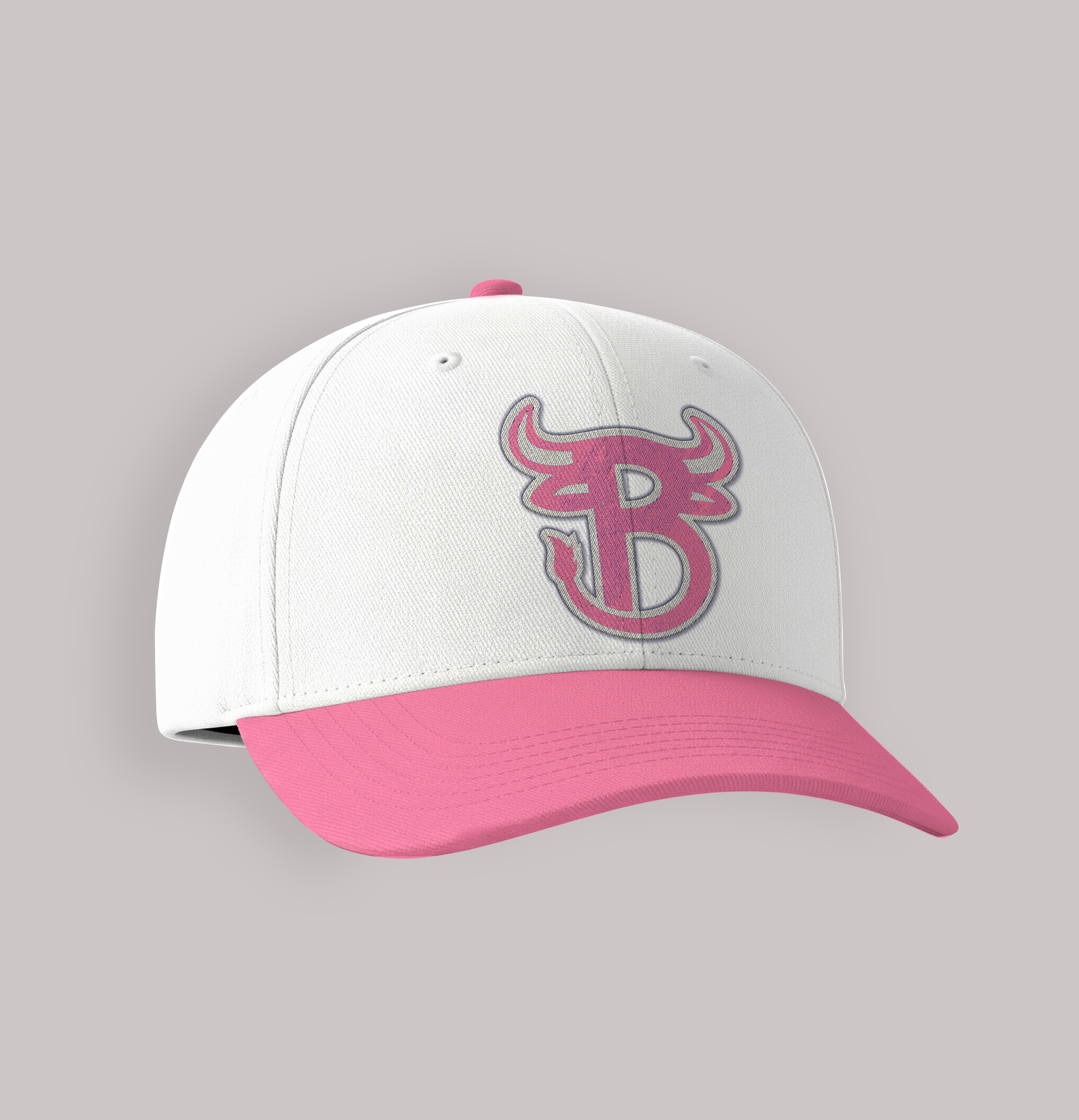
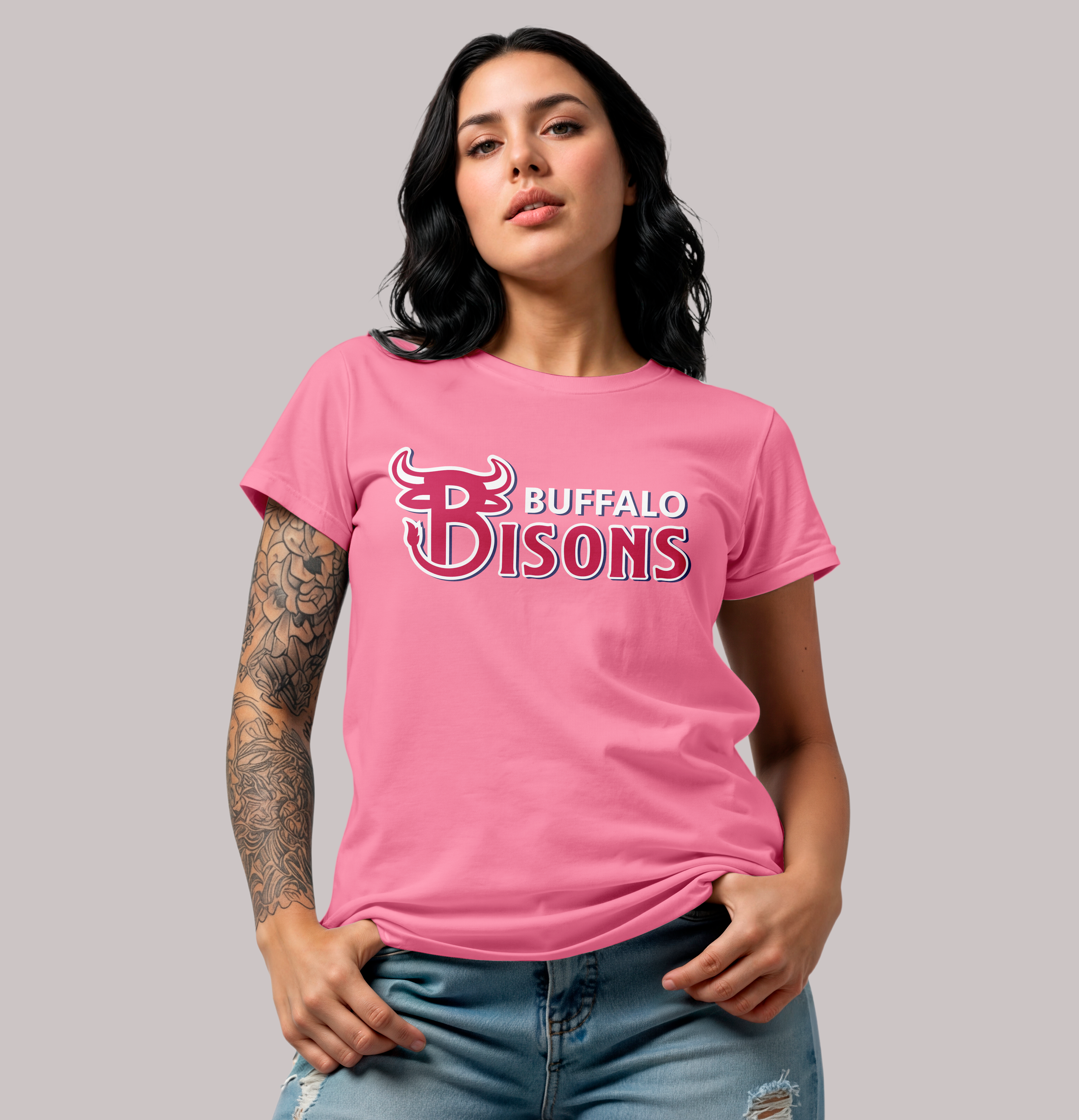
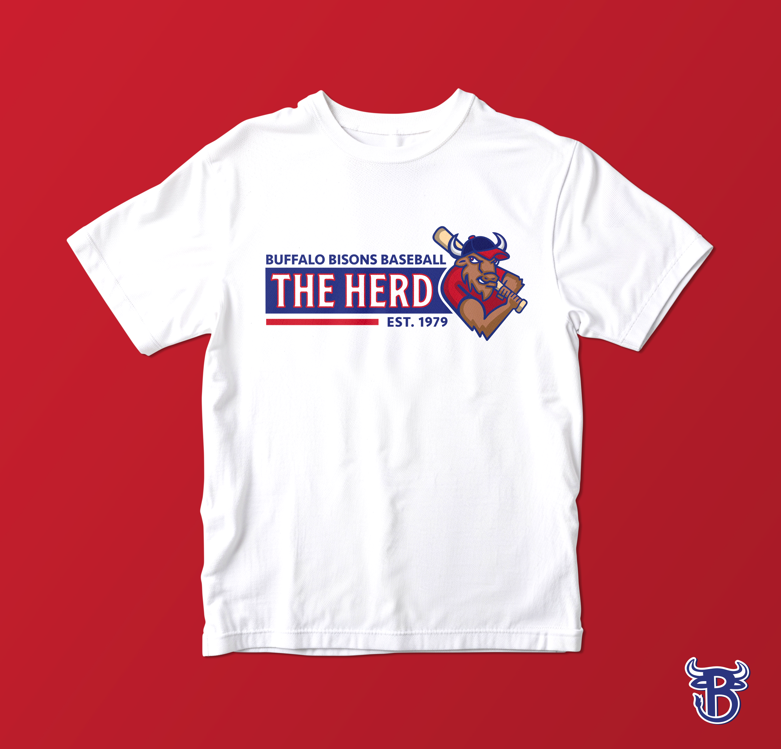
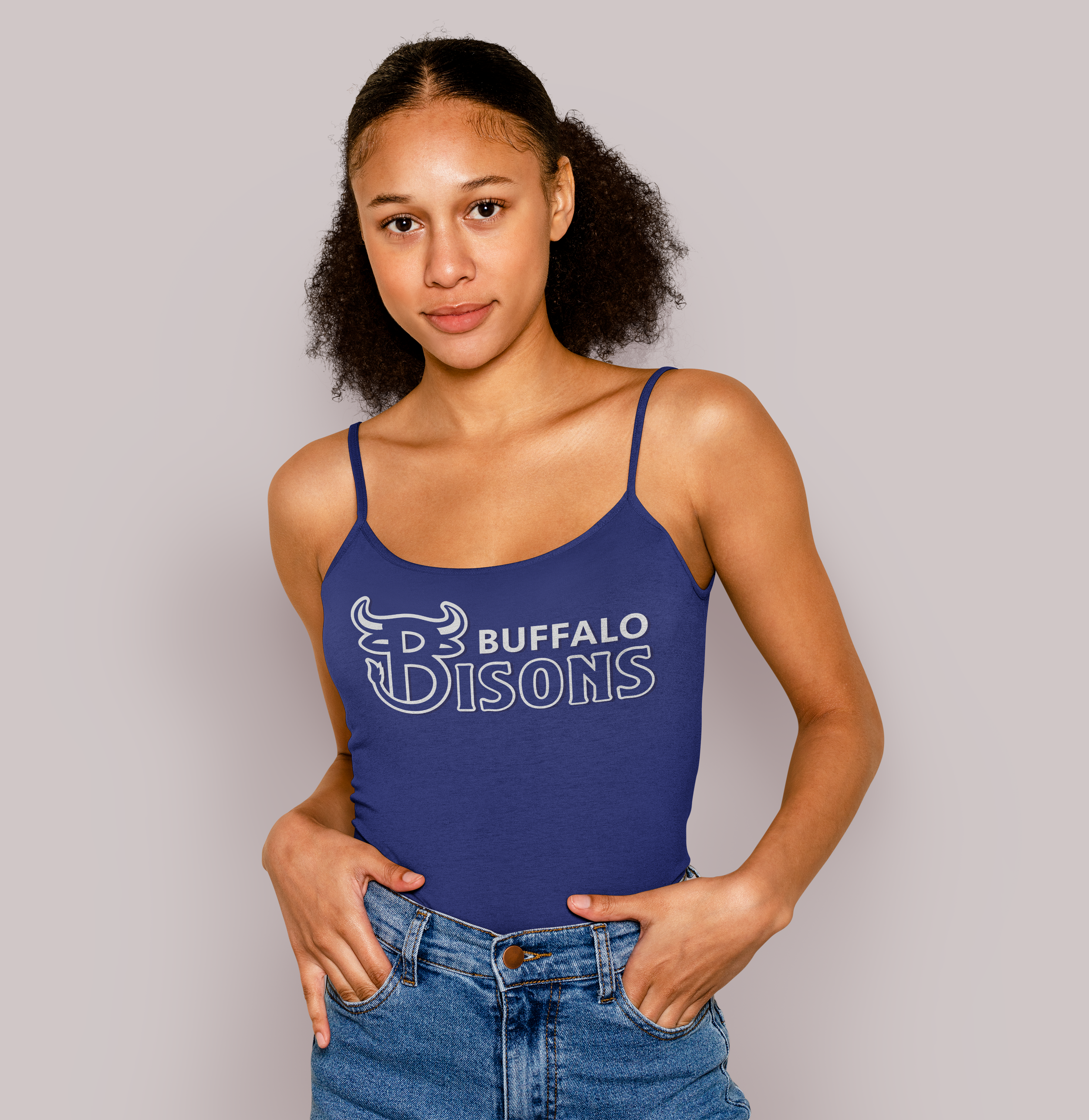
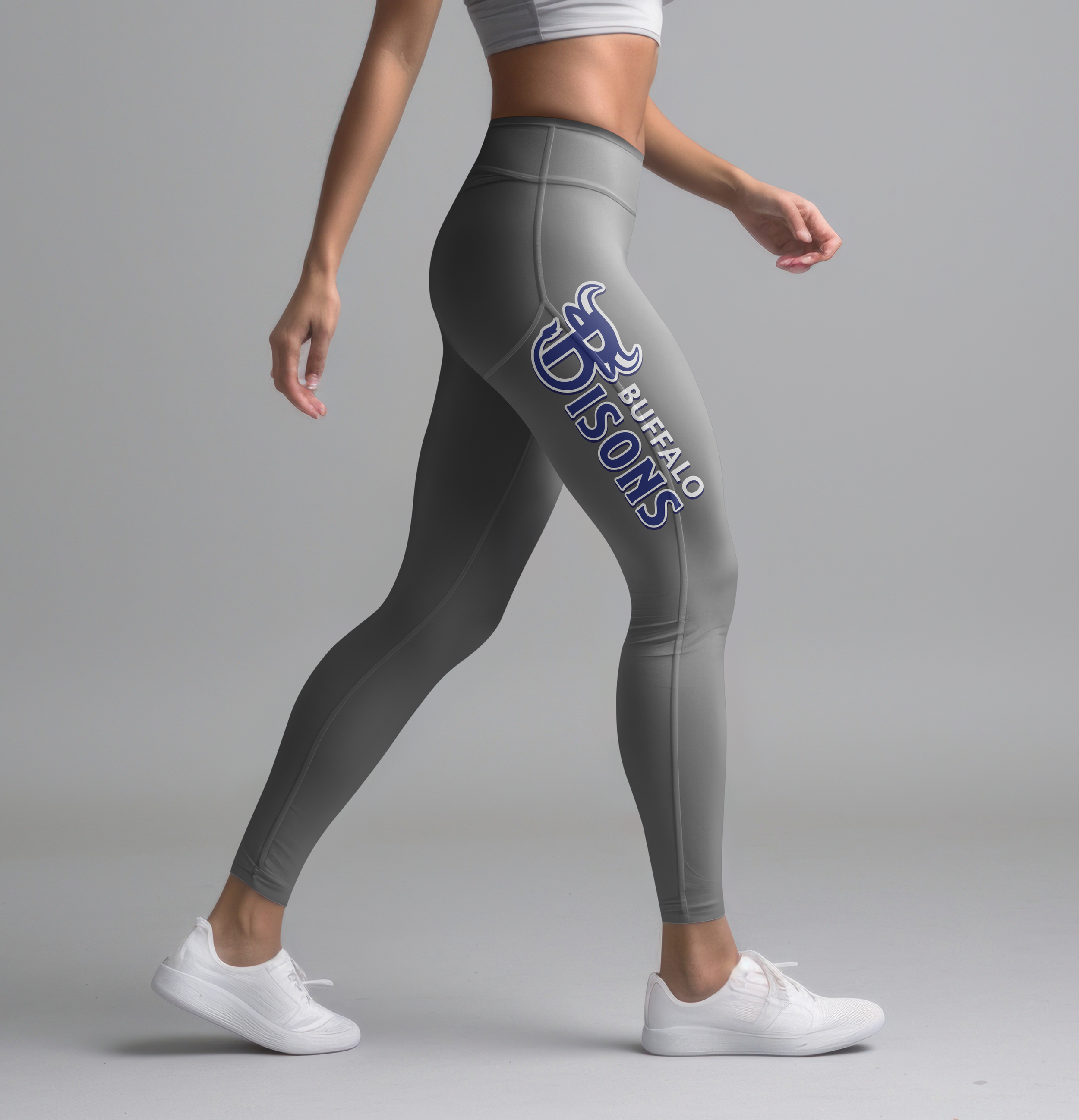
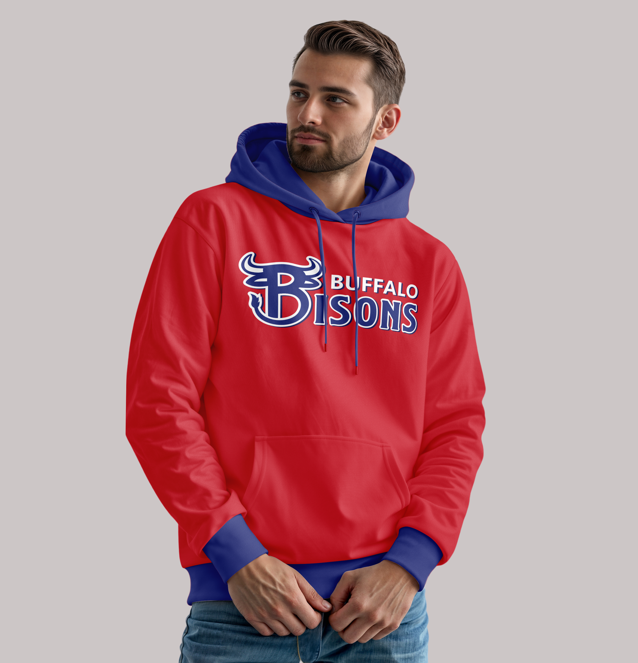
Merchandise
The merchandise extends the brand into a lifestyle collection designed for fan engagement beyond the stadium. The apparel displays the primary and supporting marks to offer a range of styles, from classic athletic wear to modern streetwear aesthetics. This brand is family-friendly and ranges from infants to adults. These mockups show how the brand can look and allow the Bisons’ identity to integrate seamlessly into a fan’s daily wardrobe.
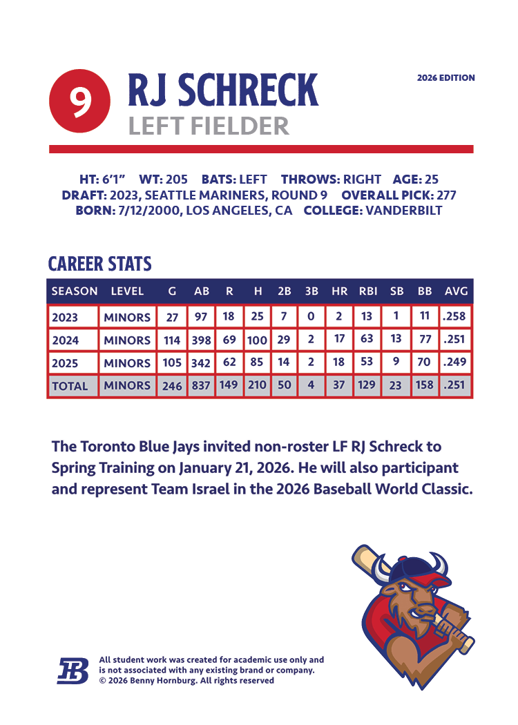
Trading Card
This is a potential Trading Card designed as a premium collectible for the Buffalo Bisons fanbase. The front of the card displays the secondary mascot mark and primary wordmark along with a featured photo of one of the Bisons’ star players. On the back, there’s a structured typographic organization of complex career statistics and biographical data.
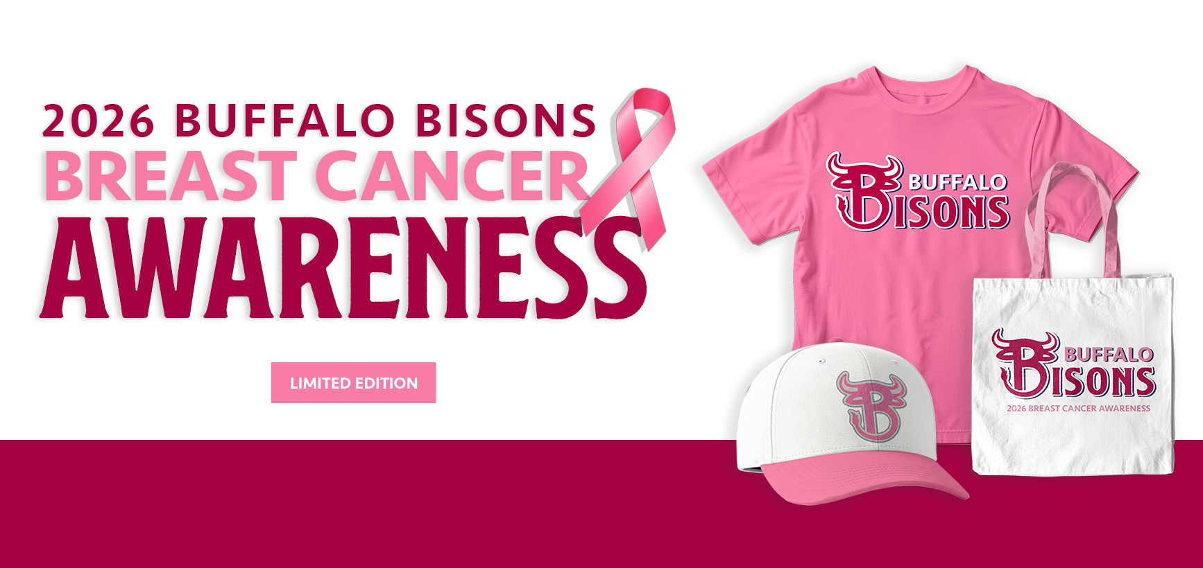
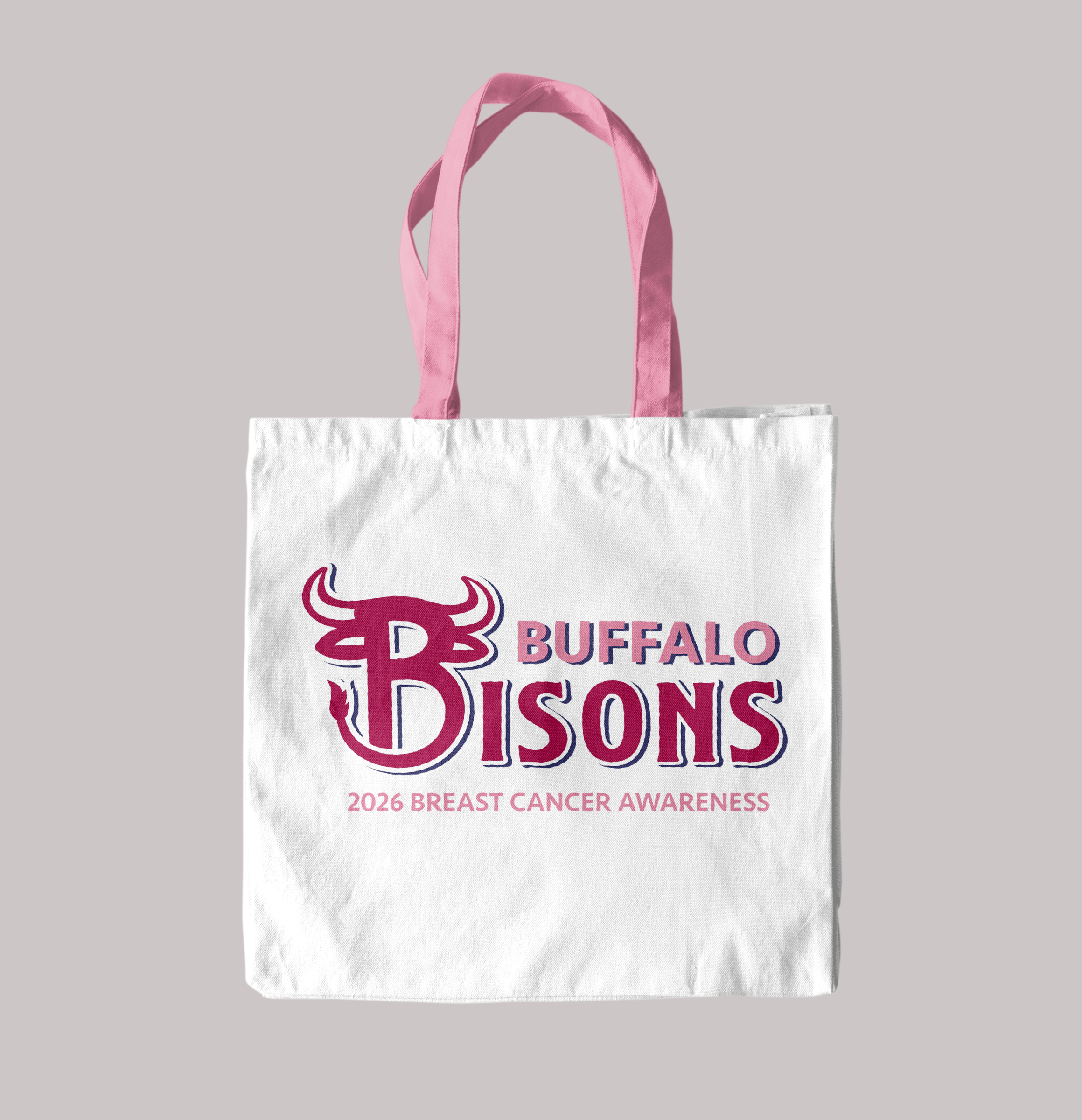
2026 Breast Cancer Awareness Campaign
This campaign uses a specialized color palette of varied pinks and is integrated across the primary wordmark and custom B lettermark. This campaign is a Limited Edition Collection that includes apparel, headwear, and a tote bag to drive community engagement and fundraising efforts. The design, however, still reinforces the team's feel with the same type treatment and aesthetic. This campaign tries to enforce awareness while maintaining the established professional aesthetic of the Bisons new brand.